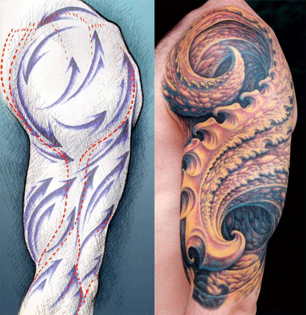
Fig. 10a & 10b is an example of a strongly contrasting design with a smooth, simple flow shown next to a diagram describing the arm's basic muscle structure and compositional flow. You can see how the important parts of the design are placed in such a way as to flatter the arm's musculature.
The light and dark areas were kept large enough that the flow of the design is clearly readable, even from a distance. For example, smaller details in the design were given less contrast than the larger shapes, as not to clutter the larger forms and distract from the overall flow. Likewise, a heavy black shadow has been placed under the large foreground shape, giving it depth and supporting the readability of its flow. This tattoo is one that has always brought a strong response from people flipping through my portfolio, despite its apparent lack of subject matter.
Join the discussion in the forum.