A good rule of thumb to consider when designing fluid tattoos is the Golden S-Curve Rule, which basically acknowledges that the human body is made of curving, fluid forms that appear to follow an S-curving flow. The arms are not cylinders, for instance; a rigid symmetrical design placed on an arm will look awkward, its symmetry struggling for dominance with the natural asymmetry of the arm. A circular design placed on the deltoid will tend to look egg-shaped, while that same design placed in the center of the chest or back could potentially fit quite nicely.
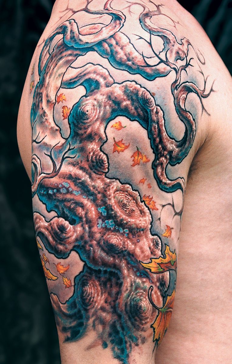
In Fig. 12a is a tree design that follows the basic S-curve of the arm. It would have been easy to make the tree point straight up and down, as many real trees do, but this would have made the arm appear too rigid. Instead, the trunk is designed to emphasize the curve of the biceps and the branches follow large, looping arcs that sit nicely on the deltoid. Straight branches are avoided entirely. The overall look not only follows the muscle structure of the arm but is designed to keep the viewer’s eyes in motion, giving the piece more energy.
Join the discussion in the forum.