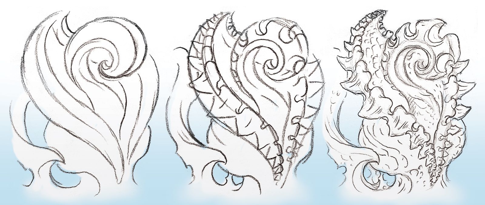
In Fig. 13a, several layers of curving elements are used to create a flowing sense of depth. The central coil is the tightest, cleanest and most prominent curve in the design. The fact that it’s clean and smooth makes it easier to get away without using a black outline. The fleshy pod enclosing it is made of a number of long flowing S-curves, all which compliment the flow of the inner coil. The zipper things follow another curve, and the points of the teeth describe yet another. The twisty organic stuff and the bottom of the pod are large and readable, sitting on parts of the arm that allow the design to take full advantage of the natural anatomy to strengthen its depth effect.
Part of the fun with this design’s flow are all the repetitions and graduations The various teeth, spines and zipper flaps all follow the clean S-curves of the design, and they graduate as they repeat (i.e., each of the elements in a series gets larger or smaller than the last one in the same series). In the central coil, the spines get bigger and bigger until they culminate as the biggest, shiniest and brightest one at the coil’s tip. All of this rhythmic motion keeps the viewer’s eye zooming around the design, giving it life and energy.
These kind of repeated patterns are created using a careful construction drawing. This method of drawing starts with long arcs and simple lines, just to make sure the design elements flow and interact in the right way. In this case, we started with a few basic arcs, making sure the flow and proportions of the major shapes were all balanced the right way (Fig. 13b) before laying out the repetitions and graduations, spacing the peaks and valleys of the teeth in a regular increasing and decreasing rhythm. The long arcs make for a good skeleton on which to build these details, ensuring that the spacing and proportions of those details are consistent and smoothly flowing (Fig. 13c).

When the basic layout looks good, the next step is to add detail and bring the drawing to completion, ready to stencil and tattoo (Fig. 13d). However, if you are laying out a large design and you start with detail before the structure of the design is finalized, it’s easy to put a lot of effort into parts of a drawing that end up being the wrong size in the wrong place. Detail can be fun to do, but it’s good to wait until the whole basic structure of a composition is going in the direction you want before getting involved in detail.
If every design is begun with a nicely proportioned construction drawing, it can prevent the need for a lot of erasing and readjusting later on in the drawing process.
Join the discussion in the forum.