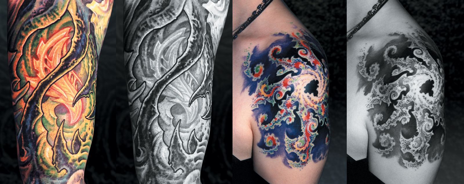
Curious to know how your color design’s silhouette will look on skin? Bring it into Adobe Photoshop (for a more detailed look at this image manipulation program, see Part V), go to Image>Mode>Grayscale, and see how its different elements contrast each other. If it looks dense but you don’t want to radically change the basic color scheme, try lightening the background color in the areas closest to the foreground shape while darkening the outer edges of the foreground areas. You can also take the opposite approach and deepen the background while lightening the foreground shapes. It matters a lot less what colors you use than how strong your positive/negative relationships are, since they are the foundation to the design’s structure.
Try bringing photos of some of your finished color work into Photoshop and converting it to grayscale (Image>Mode>Grayscale). How strong are your pos/neg relationships? We call this the Watson Test, after tattooist Watson Atkinson, who argues that any good tattoo should hold up to being photographed in black and white.


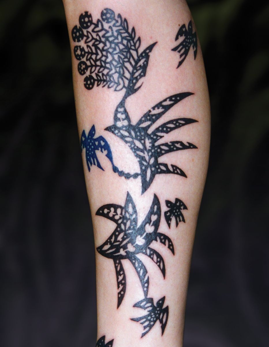
Tribal tattooing is the simplest example of pos-on-neg design. Because its relationship with the skin is so simple (either solid black or no pigment at all), a tribal tattoo’s silhouette will be the most easily readable of any style of design. Even with a fairly detailed and complex tribal design, the stark contrast between black and skin will provide maximum clarity and graphic strength (Fig. 28c). Most other styles of design don’t have this same degree of stark graphic power; artists give up some of this instant readability when they use more complex design motifs. Because of this, they must always try to strike the right balance between the tattoo’s content and its readability; the design’s overall positive/negative relationships are the essential key to maintaining this readability. Regardless of our subject matter or our technical approach, we always want to consider the silhouette and keep it as simple and clear as possible.
Join the discussion in the forum.