
Sometimes a design will use different pos/neg strategies for different elements. For instance, in Fig.32a the snail has a neg-on-pos relationship with the foliage, while the leaves have a pos-on-neg relationship with the far background. Handled this way, the leaves combine into a single dark shape, giving them a strong graphic look while still pushing the snail forward. Fig. 32b shows the opposite approach, where the snail is pos-on-neg with the foliage, while the leaves are neg-on-pos with the background, making them the lightest overall shape.

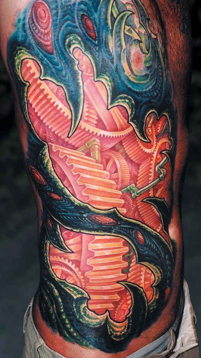
Fig. 32c shows an example of a large piece with alternating pos/neg relationships. The piece was designed to give the gears a sense of soft luminosity by using no black, dark colors or outlines anywhere in the background. The foreground shapes, on the other hand, use plenty of black, bold outlines and deep cool colors that contrast the warm background colors. The result makes the organic foreground stuff appear to be backlit, and allows for a design strategy that has strong flow and a good fit when viewed from a distance. The various planes and angles that make up the gears alternate between positive and negative, but at a lower contrast than the foreground organic stuff. By strategically incorporating both high and low contrast elements into a design, decisive pos/neg relationships can be used to keep a piece from losing its distinction.
Join the discussion in the forum.