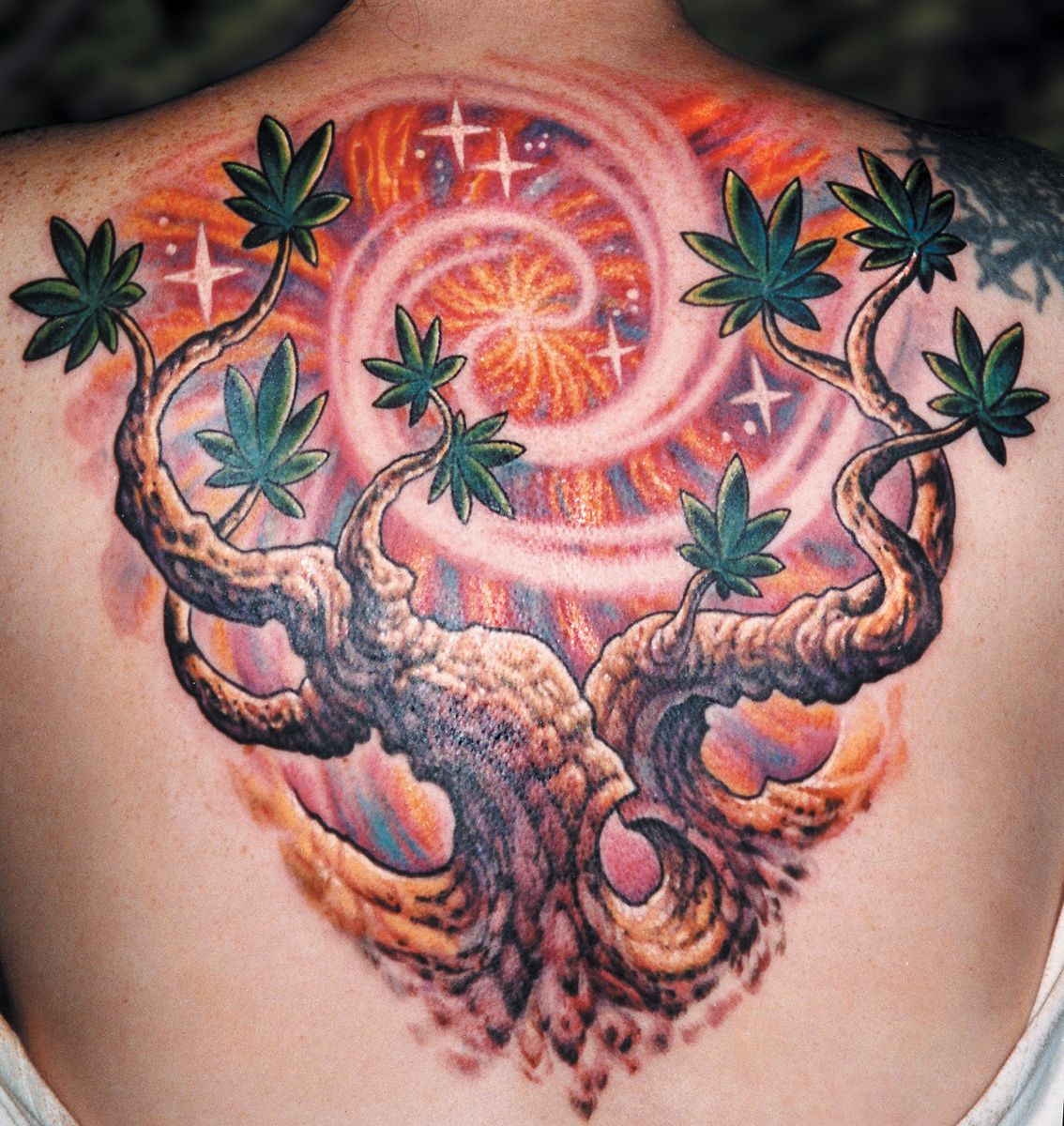

Fig. 34a shows an example of this kind of relationship. The background was done in medium colors, allowing some foreground areas to be lighter than the background while other areas are darker. To create a sense of light coming from the center of the background, the top and inner edges of the tree branches were illuminated, making them clearly neg-on-pos. Light colors such as yellow ochre and white were used inside these upper and inner edges, then plenty of rich background colors were pulled up against the outsides of these branches, which reinforces this relationship. On the bottoms of these branches where they face away from the light source, the opposite is true: Black and deep colors in the branches were pulled right up against their lower inner edges, making them boldly contrast the soft and medium background hues. To emphasize this relationship, the background color drops out into negative space just under the black lower edge of each branch, leaving a 1/4” (6mm) fringe of blank skin to help enhance the tattoo’s overall sense of clarity.
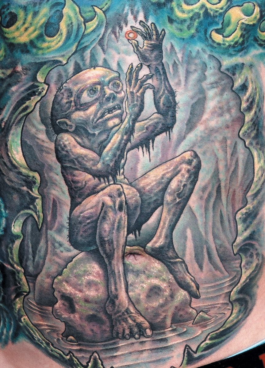
Some subjects call for a more subtle use of pos/neg relationships to avoid a cartoonish appearance. Fig. 34b is a fanciful piece that we wanted to give some realism, which dynamic pos/neg relationships can be effective at achieving. Black shading and a moderately strong black outline make the figure pop forward from the much softer background. Most of the figure has a strong pos-on-neg relationship with the softer background, but some of the anatomy facing upward toward the light source has some light upper surfaces, with soft medium background colors pulled against their outer edges to create some areas of neg-on-pos relationships. The bottom arm has a deep black lower edge, but a light upper edge with a medium dark background. Throughout the figure, pos/neg relationships switch fluidly in a way that gives the piece realism without sacrificing too much readability. While the figure is saturated with muted colors with no blank skin left, the background is done with soft watered down colors, no white or yellow and plenty of negative space to help it fall back and clearly display the silhouette of the character.
Join the discussion in the forum.