2.3) Contrast
Contrast is what makes different parts of a design stand out from each other. Whenever two elements are different from each other in any way, they will contrast each other visually. One of the goals of the artist is to make use of contrast in just the right way to make the statement they are after; sometimes bold contrast is just the right tool, making the message scream out in every way possible, where other times subtlety is the key.
To make this graphic statement, we have a variety of aspects of a design to contrast against each other: Dark versus light, warm versus cool, focus versus out-of-focus, smooth versus rough, and flow versus antiflow can be used as contrasting elements to establish a dynamic range and fine-tune a design’s impact.
The most basic element of contrast is value or the contrast of dark and light. The more dynamic range an individual design element has within it, the more it will jump forward, just as an element with less range will tend to fall into the background. For the purpose of this discussion, we’ll refer to white as having a value of zero while black has a value of 100; all other colors and gray tones fall somewhere in the range in between.
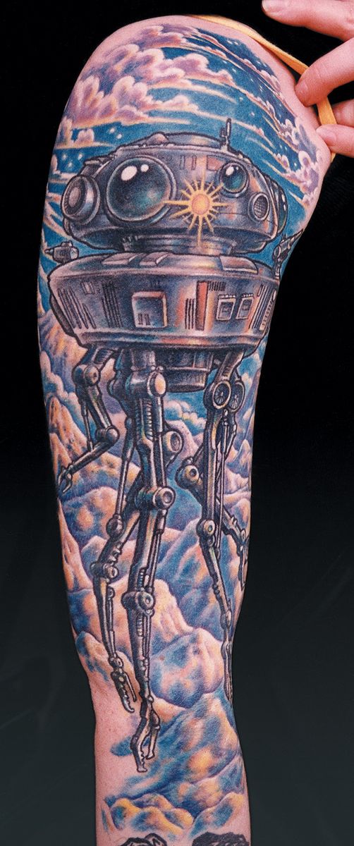
For example, let’s take a look at Fig. 37a, which features a close-up high contrast object and a lower contrast distant background. The droid, which needs to jump forward as much as possible without the assistance of too many bright colors, uses the full value range, all the way from the black outline and shading to the white highlights, giving it a total dynamic value range of 100. The landscape in the background, on the other hand, is rendered using no outline- gray wash instead of black and no colors darker than 60, compared to the 100 of the droid. This way they appear to be obviously way off in the distance, the same way that mountain ranges in real life appear to have less and less contrast as they get further away and are lightened by the atmosphere between them and their viewer.

Join the discussion in the forum.