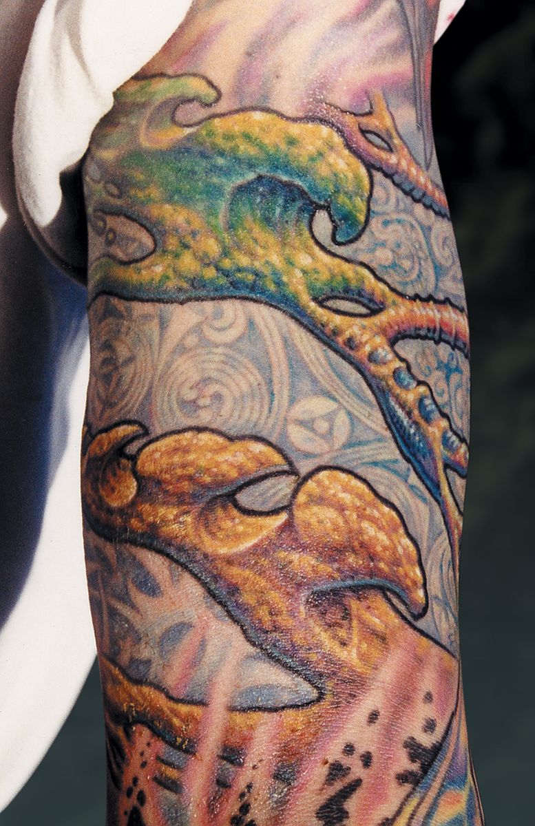
We use similar contrast methods in Fig. 38a. The foreground shapes, which need to stand out, are given a bold outline and a value range of 100, using plenty of black and deep colors to complement the yellow and white highlights. The background is kept much softer with a total range of about 35. Wherever possible, the foreground shapes are given a clear pos-on-neg relationship on their undersides and a neg-on-pos relationship on the top parts; anywhere we can’t do this, the bold black outline compensates.
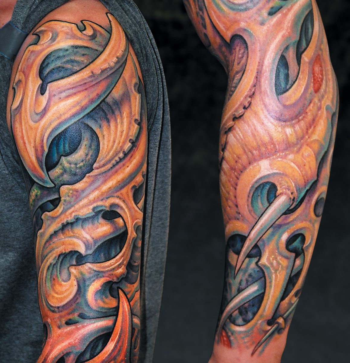
Limiting the value range of the background works well for compositions with dark backgrounds as well. In Fig. 38b we have an abstract design that aims to create a sense of depth by lifting its light colored foreground objects out from the skin by using a dark background. The deepest parts of the background are mostly black and dark colors, with a few areas of medium color and no light color or white. This keeps the dynamic range of the background to around 50 or 60, while the foreground objects use the full range, from their black outlines and sharp detail to their white highlights. To keep the design from getting too dense, we avoid using much black shading in the foreground.

The key is to use your black shading selectively to give your design its strength. A simple rule of thumb: If your background has a lot of black shading, use very little in your foreground. Keep in mind that shading done with color will age just as well. If you have a dark foreground object, keep the background light. If you have moderate amounts of black shading in both your foreground and background, you run the risk of losing clarity; your best bet is to choose either your foreground or your background to concentrate your darkest shading. This selective use of dark shading applies to deep concentrated colors as well as black.
Don’t Use Too Much Black!
There is a time-tested understanding that black outlines and shading are critical to the strength of a tattoo. Although this is partially true, many have misinterpreted this idea into thinking that each and every element in a design has to have strong black shading. The problem with thinking this way is that a tattoo with heavy black shading in every element will look dark and dense, and may have issues with readability even while the piece is new. My usual advice is to use strong blacks in either the foreground or the background, but not both at the same time.Join the discussion in the forum.