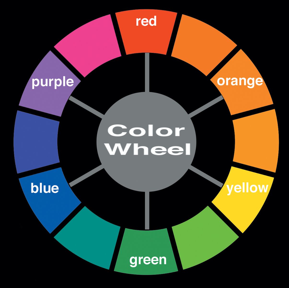
Colors have contrast, too. In art school lingo, we have our warm colors and our cool colors; warms consist of the yellows, oranges and reds, which are normally associated with fire and heat, plus the yellow-greens and red-purples. Cool colors consist of blues, blue-greens and the blue-purples, normally associated with water and ice. Warm and cool colors contrast each other naturally; warm and cool contrasting relationships of neighboring design elements need to be considered in the same way that pos/neg relationships should be.
Pictured below is a color wheel, which artists and teachers have used for many years to help themselves and their students understand color relationships better. Circling around the wheel is the full spectrum of colors in their natural order. When we draw a line straight through the center of the wheel, the two ends of the line will point to the two colors opposite each other.
Whenever two colors are exactly opposite on the color wheel, they are referred to as complementary colors. When two colors are complementary, they have the maximum contrast of color available in the color wheel, so that when these colors are used in neighboring design elements, they pop out from each other. These pairs of complementing color include blue versus orange, purple versus yellow and red versus green.

Some Color Advice
While placing complementary colors next to each other will make them appear bright, mixing them together will accomplish the opposite and create mud. Sometimes this muddiness is what we are looking for (I occasionally dip between orange and lime green to create warm bile colors) but usually we want to be careful to mix only compatible colors to keep the mix bright. If two colors are neighbors on the color wheel, you can mix them easily and get a pure color from them; for instance, blue and green will make turquoise. Two colors from further apart on the color wheel, though, such as purple and orange, will make a gray or brown.
If you are creating a color field that blends between two colors that are opposite of each other, you will need to use a transitional color. For instance, the sky around the temple back in Fig. 23b blends from orange into blue. To keep these two colors from blending into brown where they overlap, pink is used as a transition. Pink will mix with orange to make peach, and with blue to make lavender, so using it to bridge between the orange and blue is perfect for preventing brown in the sky.
Some transition colors:- Pink bridges orange with blue or purple
- Blue bridges between green and purple
- Yellow bridges between orange and green
A quick glance at the color wheel will show you what color will best bridge between two other colors. If the two colors you need to blend are too far apart on the color wheel, you may need more than one color to bridge them. For instance, to bridge between red and green, you would need to blend from red to pink to blue to green.
Join the discussion in the forum.