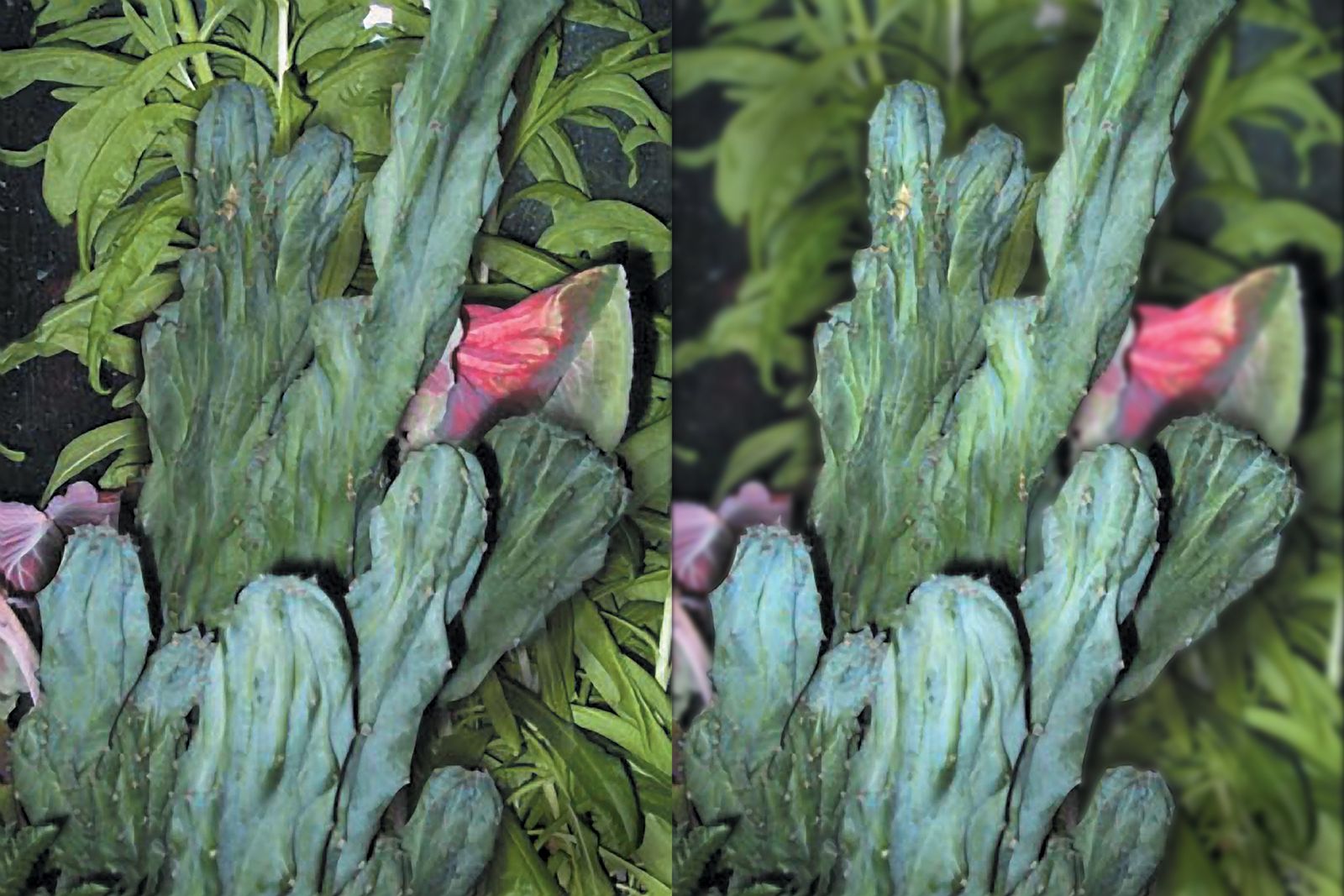

Focus works the best when we have out-of-focus elements to contrast the sharply focused ones. In Fig. 42a and Fig. 42b we have two similar shots of the same subject, with one of the image all in focus, the other focusing only on the foreground element, allowing the background objects in the picture to blur. The one that’s all in focus produces a sense of busyness, as every part of the shot has an equal amount of detail, competing with the central object. The other shot, although compositionally similar, is much more clearly readable, with the less important elements being allowed to drop out of focus. In addition, the background in the second shot is also both cooler and darker than it was in the first image, widening the difference in dynamic range even further between the foreground and background.
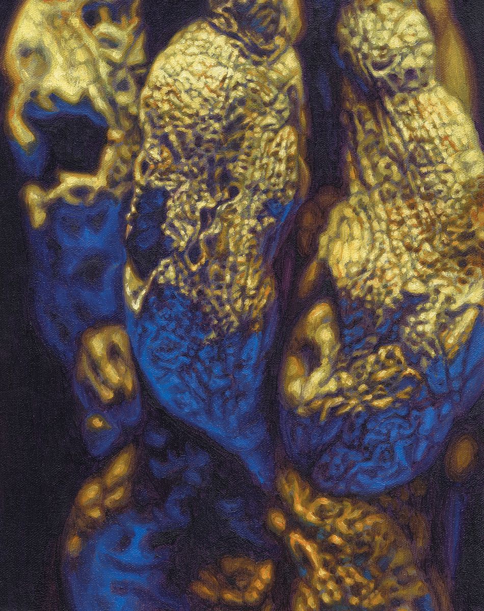
We can create focus and out-of-focus effects by using sharp edges versus fuzzy edges, high contrast versus low contrast and sharp detail versus no detail. I’ve been practicing focus tricks as much as possible in my paintings. Fig. 42c is a composition with only parts of it in sharp focus. I achieved this by first photographing the object, then duplicating the image on canvas using the photo as a guide. I used a projector to trace the photo onto the canvas with colored pencil, then kept the photo taped up to the easel so I could refer to it continuously while painting. One thing that seems to help this kind of effect dramatically is to use different sized brushes for different areas. In the focused areas the smallest brushes are best, since they will naturally create the tightest detail.Moving outward into less focused areas, the larger brushes are better for the job. In these kinds of blurry areas it’s important to refrain from using any small brushes at all, because that could easily spoil the effect by canceling out the softness.
Join the discussion in the forum.