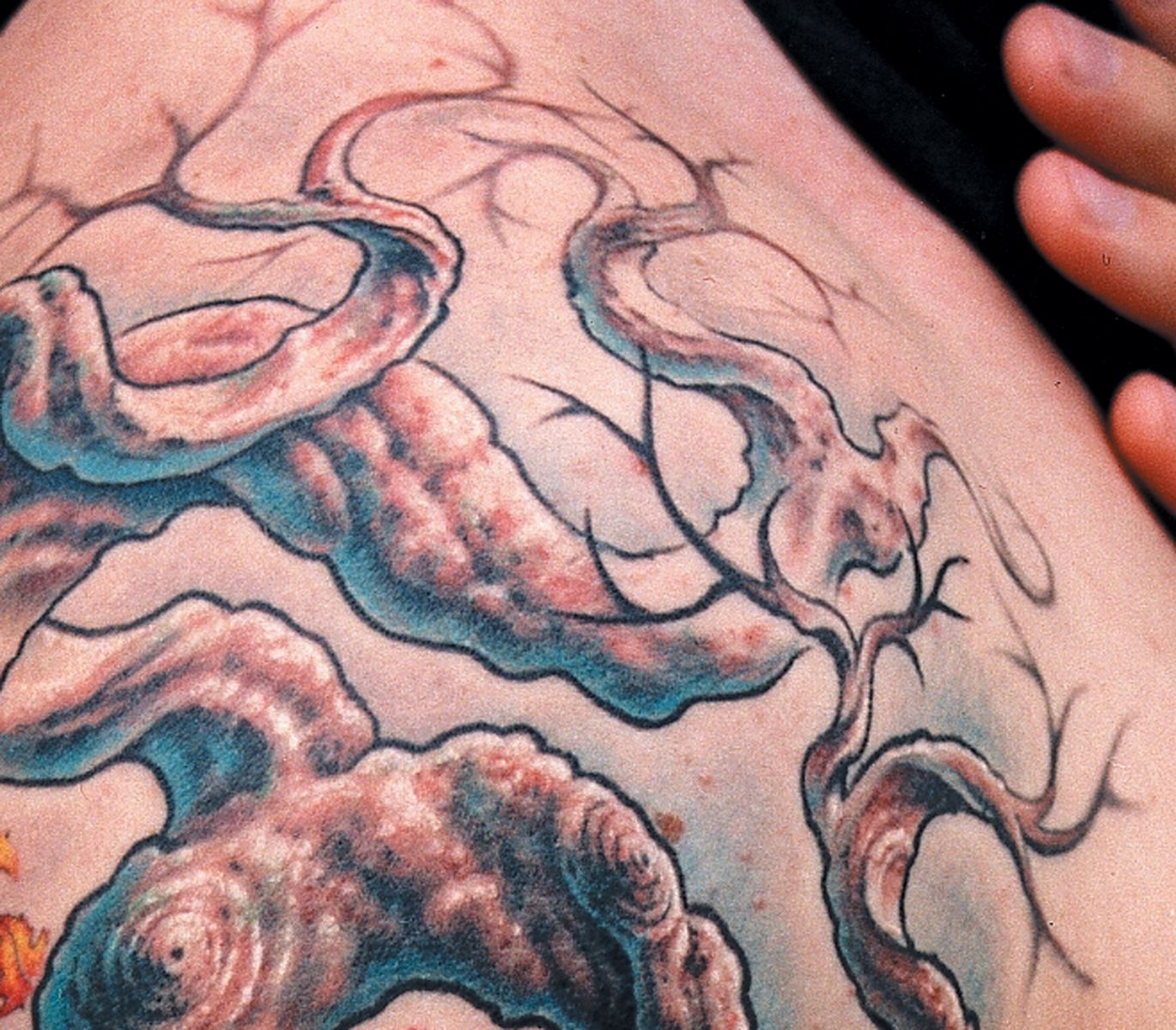

Let’s look at a close-up shot of the tree piece we discussed earlier in Fig. 12a and zoom in closely on the branches, where you’ll see an example of the use of focus (Fig. 43a). The smallest twigs of the branches, instead of getting tinier and tinier like hair (and creating a cluttered look), were rendered with a 5 magnum using smooth looping brushstrokes to create soft edges. A 5 round was then used to unite the soft twigs with their more focused branches. In a few places, out-of-focus twigs were made to pass behind the focused branches in front of them, creating more depth. This combination of effects creates a distinct sense of depth, while still keeping the upper part of the design light and minimal, as per the client’s request.
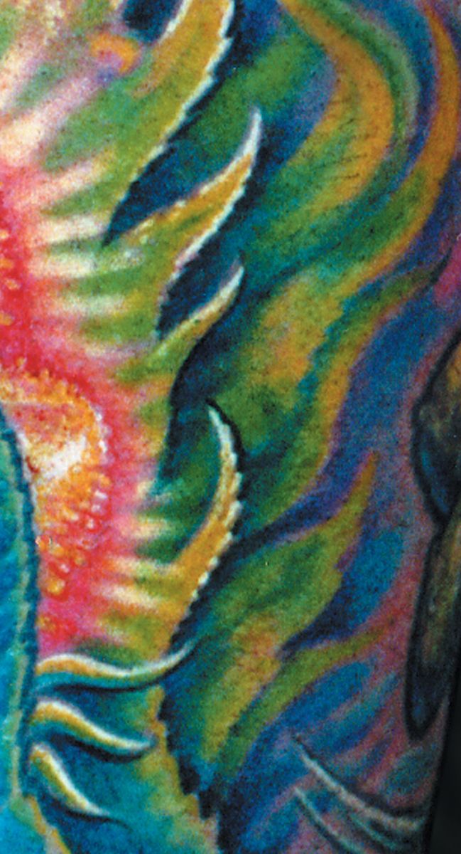
Fig. 43b shows a different use of focus, this time with a crisp neg-on-pos foreground shape jumping out from a darker, cooler and less focused background. Getting this look was actually pretty simple. The foreground leaf was outlined and its edge sharpened with a tight 3, with the lower edge of each shape lined darker than its upper edge. After coloring, its white highlights were pulled out to its edge with the three as well, maximizing its sharpness. The background was done using the magnum only, with loose oval strokes of the machine: This way, the edges of the shapes were deliberately blurred a bit. The background area is also cooler than the foreground leaf, with no yellow and more blues, and contains no white to compete with the foreground highlights.
Join the discussion in the forum.