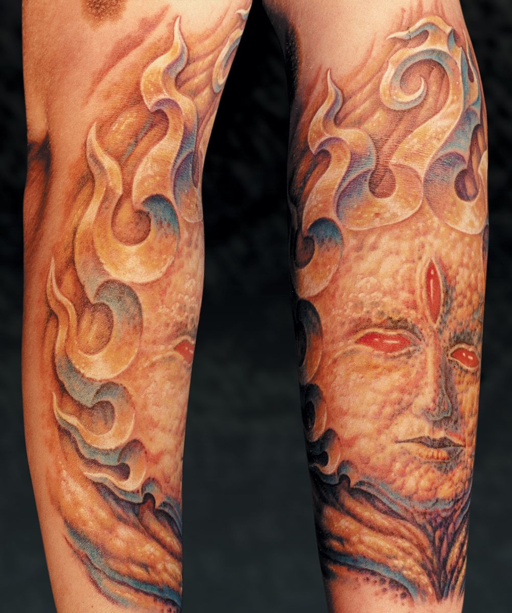
In Fig. 44a we have another example of the use of focus. The edges of the important features are given sharp definition and strong value contrast, while the simple areas of the face and most of the background have less contrast and softer edges. A 7 mag is used for most of these background areas and much of the face using light, looping movements to keep the edges soft. Then a 5 round comes into play, sharpening the edges of the rays and adding detail and definition to the facial features, giving the most value range to the eyes, nose and mouth, creating the sharpest focus there and making the features stand out from the rest of the design.
There are also many examples of atmospheric effects in this book which are kept out of focus with blurry edges to help emphasize the main subject of the piece. The wind on the fruit-and-vegetable sleeve in Chapter 2.1(Fig. 19a) is an example of an unfocused element passing in front of focused ones; the atmosphere behind the trees in both Fig. 12a and Fig. 23b show the focused element in front of the blurry background. Both strategies have their time and place.

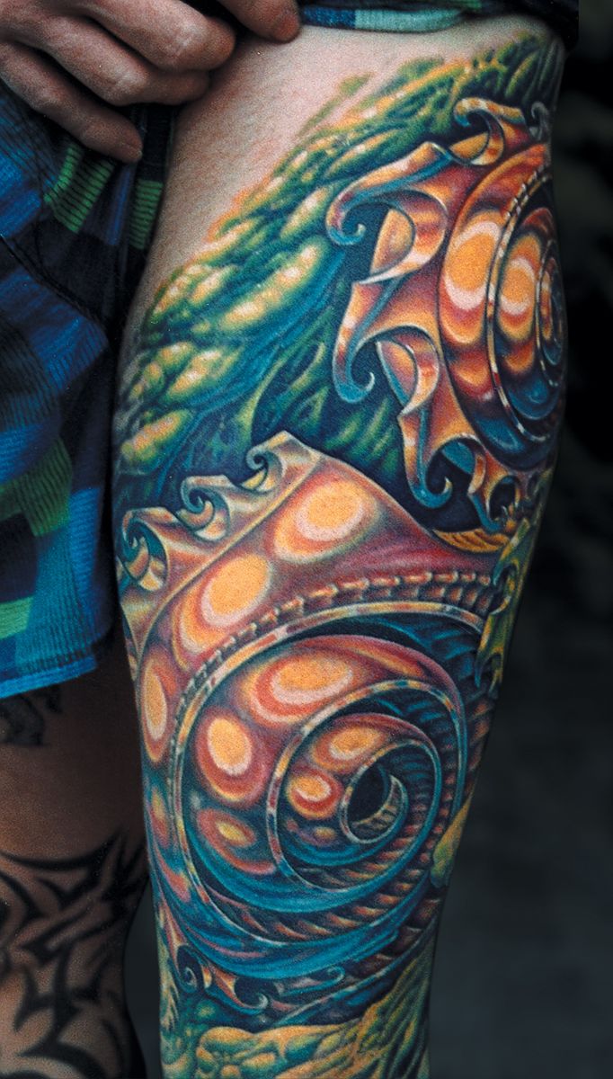
Textures are also good tools to express contrast; objects with different textures will stand out from each other as surely as if they were different colors. A smooth, shiny object will stand out from a bumpy and pitted environment. Similarly, a rough bumpy object can leap forward from a smooth, simple background. Smooth and rough elements can also be balanced equally, as in Fig. 44b. Other textures besides smooth and bumpy exist as well, such as the repeated patterns in biomech designs or the veiny patterns in the red cabbage on that fruit-and-vegetable sleeve. With a little imagination, we can concoct a whole spectrum of different textures to play against each other.
If we want textures to really contrast each other, they each need to have a different basic silhouette- when we blur our eyes and look at them, their differences should be clearly visible. Smooth textures are more open and have less detail; they will contrast a bumpy, more detailed texture in a similar sense that an out-of-focus area will contrast a focused object. Although bumpy organic textures and biomechanical textures may have similar amounts of detail to each other, the detail is organized so differently in these two subjects that their silhouettes are distinctly distinct from each other; the one being fluid and random, the other being more rigid and repetitive. That veiny pattern on the cabbage has yet another distinctly different silhouette. Overall, though, the difference in contrast between textures is always greatest if one of them is smooth and open, the other tight and detailed.
Join the discussion in the forum.