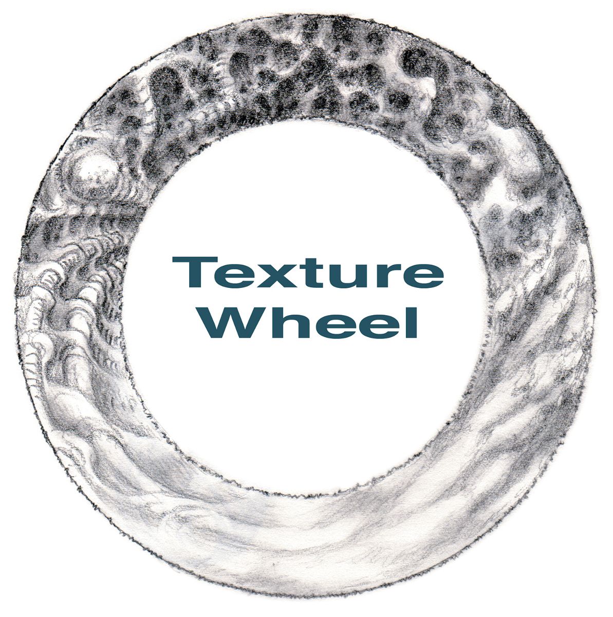
The range of contrast between different textures will be largely determined by the difference in the amount of detail between one texture and the other. If we were to make a texture wheel similar to our color wheel, the most densely detailed textures would be opposite the smoothest textures, with a whole range of density of detail in between (Fig. 45a). Comparing the top to the bottom are the opposites of detail density, with it being smooth and open at the bottom and tightly detailed at the top. Comparing the left area with the right are the opposites in detail organization, the left side being more regular, the right side being more random.

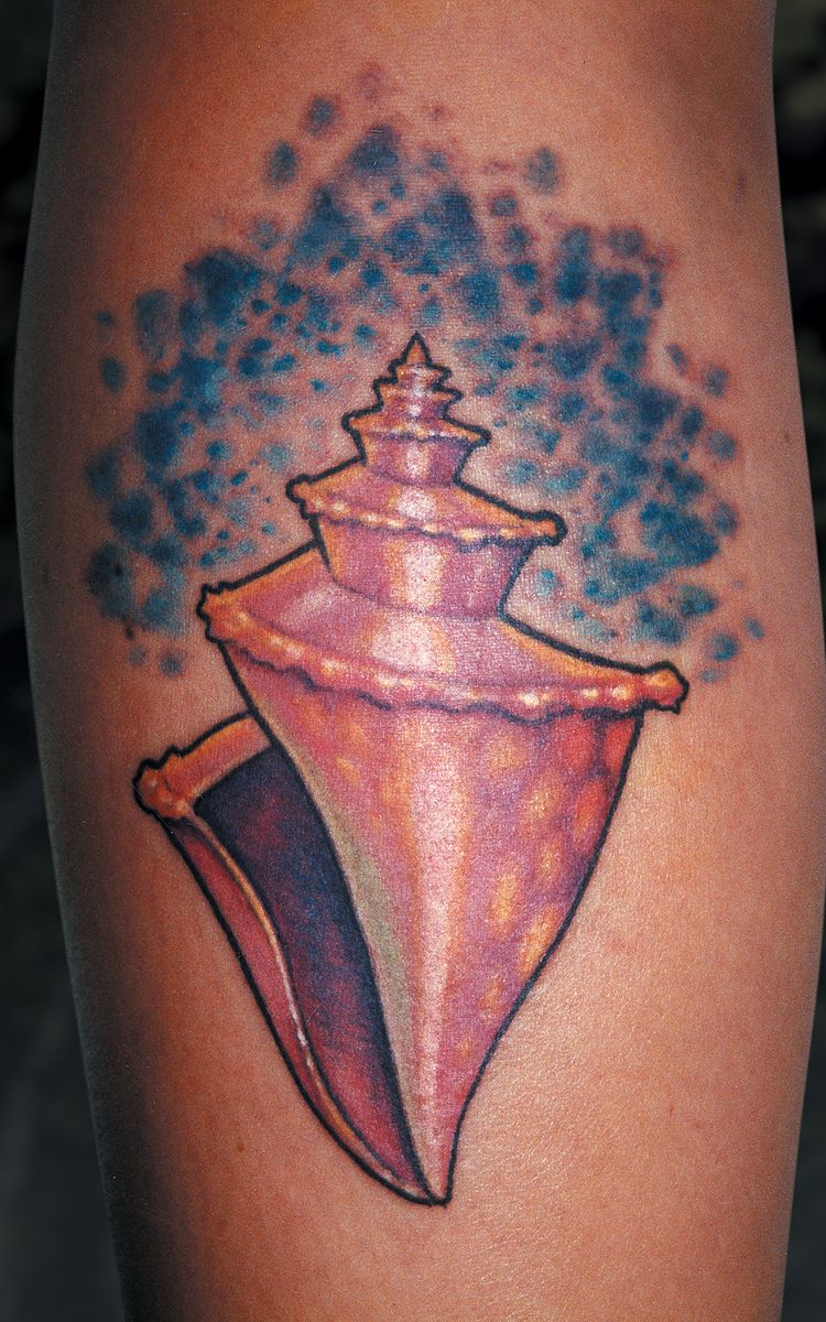
The piece in Fig. 45b is a simple tattoo with a single foreground object and a background texture. The shell in the foreground is smooth and shiny, so it contrasts the bumpy texture in the background. It was made to appear slick and shiny by giving it a sharp, clean curving black outline and a long, smooth white highlight down the center. In real life, smooth shiny objects will often show long “streak” highlights like these. The shell was given a polka-dot pattern to make it more interesting, but the edges of the spots were kept soft and out of focus, as not to lose the smoothness of the shell. Making the polka-dots disappear behind the long white highlight strengthens the smooth shiny effect. Smaller, sharper white highlights were put in the bumpy ridge spiraling around the crown of the shell to give it a hint of texture and make it appear glossier. For added color contrast, small yellow highlights were run along the upper edge of the shell to contrast the cool blue background.
Join the discussion in the forum.