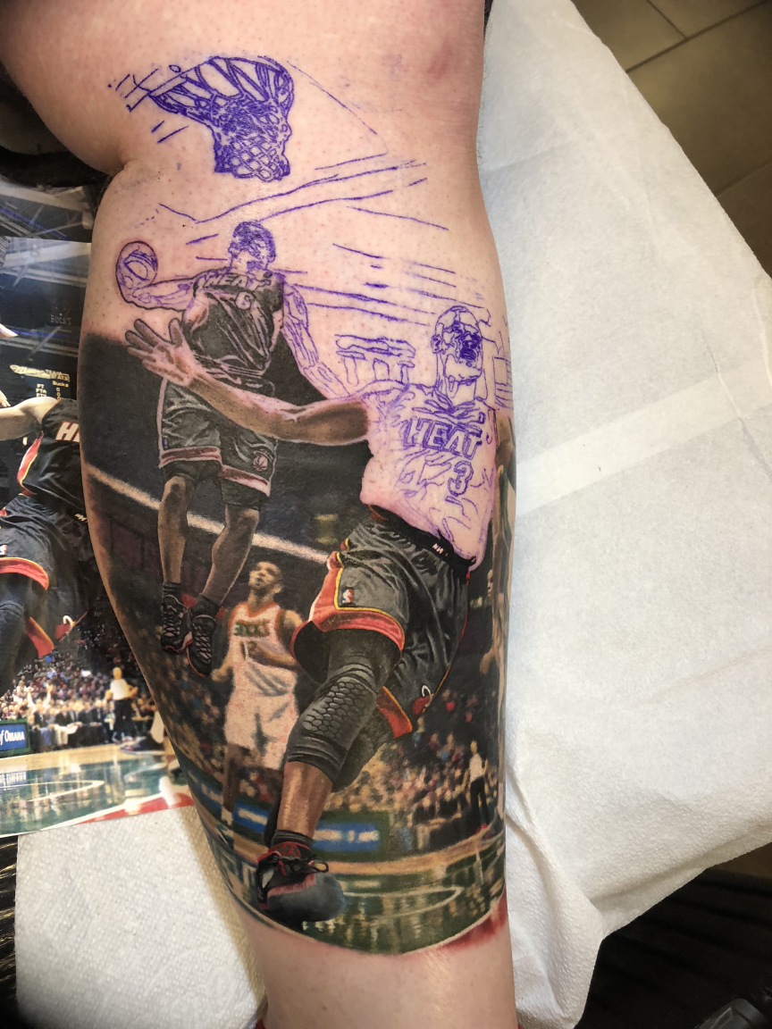
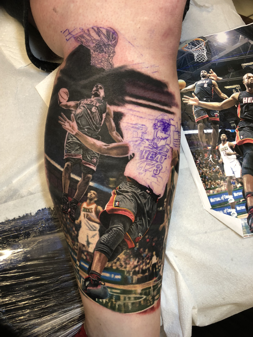
 On Day 2, Steve continues over to the left and then upward. Note how the background player has been kept soft and blurry, and how effective that is in offsetting Wade's sharply rendered shorts and kneepads. Far background detail has been dropped all the way out of focus, leaving only a suggestion of thronging bleachers, and a strong diagonal line which helps suggest an upward, monumental perspective. Note how LeBron James' uniform has been blocked in and is partway finished.
 More of the background has been blocked in. Adding this large area of dark shading helps Steve to judge how to handle the final rendering on James' uniform. Note the differences between the reference photo and the background area in the tattoo, where all detail has been dropped out of focus, leaving only blurred diagonal perspective lines.

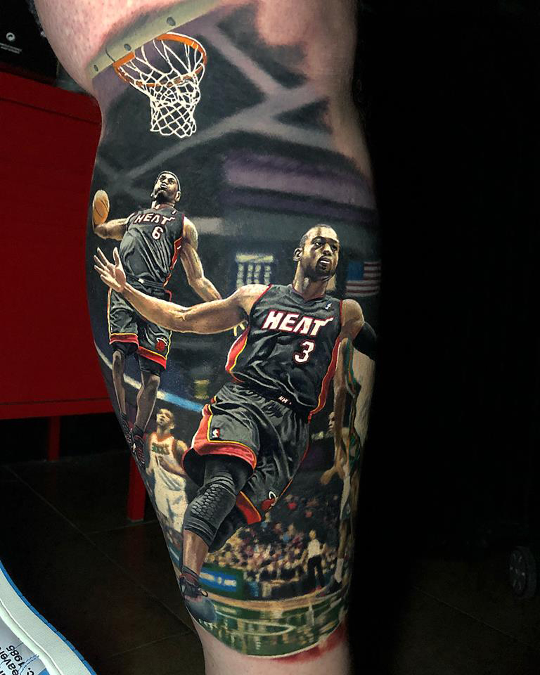
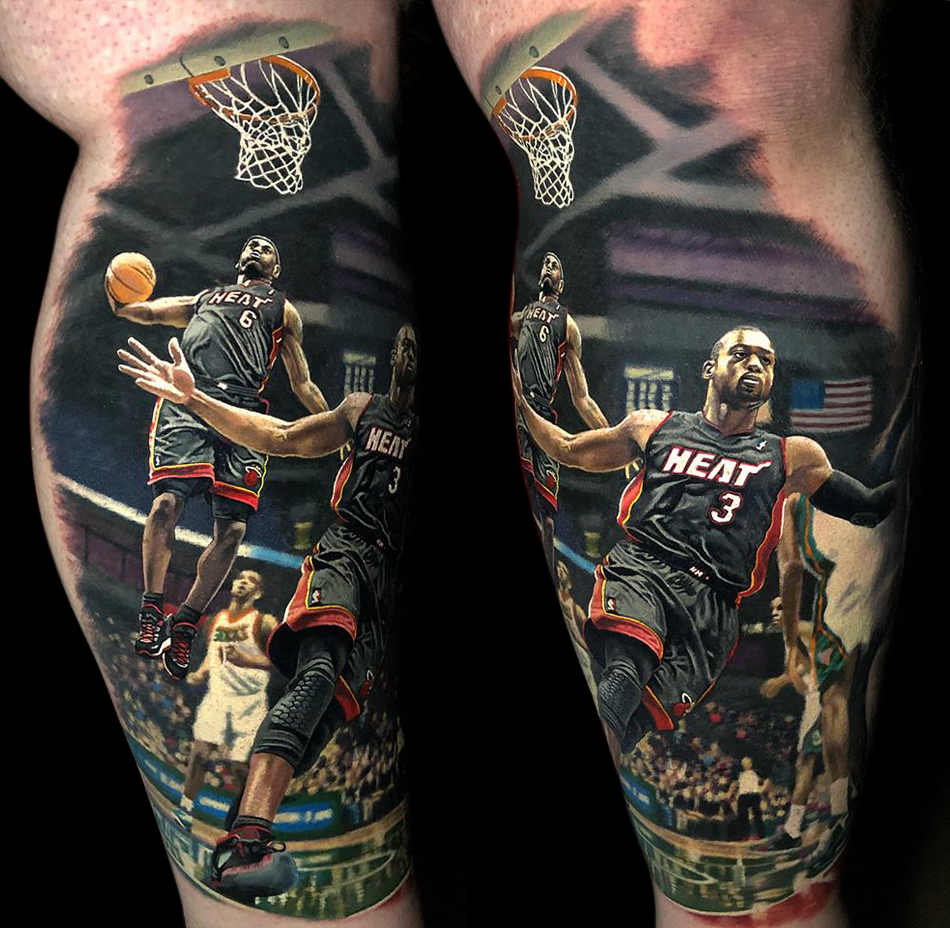
 After around 21 hours of work over two days, here is the finished piece. Steve chose to crop the image and zoom in close so that the image fills the height of the calf and the two players can be given the full realism treatment. This decision was made at the cost of part of Wade's left arm, which fades away into a piece on the other side of the leg- but it was a compromise that made it possible to make the image the optimum size and to capture the energy of that moment. The selective use of focus is a key element not only in helping separate the layers of the design and enhancing its clarity and readability, but it also is helpful in adding power and drama to the piece.
Steve can be found @stevebutchertattoos on Instagram and stevebutchertattoos on Facebook.